The context
In social media marketing, you often need to report ongoing metrics like audience engagement and follower growth—but as campaigns launch and conclude, you also need to explain how those performed in their own right.
Did the audience like the new content? Were they indifferent? Did they ignore it when they would usually engage?
The problem
In response, many social marketers fall into the trap of simply reporting "vanity" metrics—e.g. "We got 100k engagements this month!"
But there are issues with this:
- It doesn't provide insight into how new campaigns or content types performed. Even if you break it down further to "This campaign drove X engagements," it's still meaningless without context.
- It doesn't account for differences in platforms. Many social campaigns are cross-posted to multiple platforms. For example, what's well received on X/Twitter may do poorly on LinkedIn. It's important to identify this in the data and adjust your strategy accordingly.
- Communicating context to decision makers is difficult and time consuming. VPs and executives often don't have time to understand technical details or remember what good and bad performance looks like.
The solution
An ideal metric solves all of these problems.
- It shows the impact of new campaigns or content types
- It indicates how each unique platform responded
- It's easy to understand at-a-glance by busy people
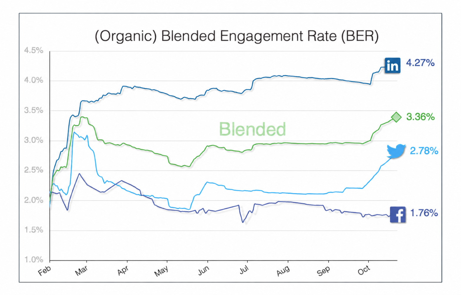
Enter the Blended Engagement Rate (BER) metric and data visualization. Like a standard Engagement Rate metric, BER measures how often people are engaging with (liking, clicking, bookmarking etc) content. But importantly, it also compares that to a historical baseline and makes this comparison visible as a single line moving up or down. This can be used to indicate average performance across all platforms (Blended), or broken out by platform in additional lines.
How does it work?
Simply put, it aggregates all engagements and impressions (views) for a given time period (usually a fiscal year) and makes the total ratio visible as a data point for every day of that year. The insight comes not from knowing this ratio on a given day, but from looking at the slope of the line created by plotting these numbers on a graph.
In this way, it's similar to the concept of a derivative in calculus, where the slope of a line at a given point provides information about rate of change. An upward slope during a campaign period means engagement is accelerating relative to the year-to-date baseline. A flat or downward slope means it isn't, regardless of whether the absolute BER value is "high" or "low" that day.
This is what makes the metric so useful for evaluating campaigns at a glance. Instead of asking "is 4.2% good?", a person only needs to ask "did the line go up or down while the campaign was running?"
It's also worth noting that because of how BER is calculated, it avoids a common mistake made in social media marketing, which is reporting an average of averages. BER is a weighted average, meaning each platform's scale is automatically factored into the Blended number, rather than every platform counting equally regardless of size.
For more information, or a template for calculating BER, reach out to aetavan@gmail.com